3/31/2008
Ajax Mistakes
Using Ajax for the sake of Ajax
Breaking the back button
Not giving immediate visual cues for clicking widgets
Leaving offline people behind
Don’t make me wait for Ajax
Sending sensitive information in the clear
Assuming AJAX development is single platform development.
Too much code makes the browser slow
Not having a plan for those who do not enable or have JavaScript.
Inventing new UI conventions
Changing state with links (GET requests)
Blinking and changing parts of the page unexpectedly
Not using links I can pass to friends or bookmark
Not cascading local changes to other parts of the page
Asynchronously performing batch operations
Scrolling the page and making me lose my place
Blocking Spidering
3/30/2008
as simple as possible, but no simpler: Drip: IE Leak Detector
as simple as possible, but no simpler: Drip: IE Leak Detector
How it Works
Fortunately, Internet Explorer's architecture made this app fairly easy to build. It's basically a simple MFC app with a browser COM component in it. The strategy for catching leaked elements is as follows:
* When a document has been downloaded, sneakily override the document.createElement() function so that the application is notified of all dynamically-created elements.
* When the document is fully loaded, snag a reference to all static HTML elements.
* To detect leaks: navigate to a blank HTML page (so that IE attempts to release all of the document's elements),
* force a garbage-collection pass (by calling window.CollectGarbage()),
* and look at each element to see if it has any outstanding references (by calling AddRef() and Release() in succession on it).
Within the leak dialog, each element's attributes are discovered and enumerated using the appropriate IDispatch/ITypeInfo methods.
px is actually a relative font unit
The rule:
h1 { line-height: 1.2em }
means that the line height of "h1" elements will be 20% greater than the font size of the "h1" elements. On the other hand:
h1 { font-size: 1.2em }
means that the font-size of "h1" elements will be 20% greater than the font size inherited by "h1" elements.
When specified for the root of the document tree (e.g., "HTML" in HTML), 'em' and 'ex' refer to the property's initial value.
Pixel units are relative to the resolution of the viewing device, i.e., most often a computer display. If the pixel density of the output device is very different from that of a typical computer display, the user agent should rescale pixel values. It is recommended that the reference pixel be the visual angle of one pixel on a device with a pixel density of 96dpi and a distance from the reader of an arm's length. For a nominal arm's length of 28 inches, the visual angle is therefore about 0.0213 degrees.
以 Container 實作 Light Box
以 Container 實作 Light Box
解決 IE6 <div> 浮在 <select> 上會的問題
可設定與某節點的相對位置
開啟與關閉可以使用動畫效果
Modal 效果
可拖拉
可用簡單的設定達到 AJAX 的效果
可限制不超出視窗範圍
利用 Get 工具跨網域存取資料
利用 Get 工具跨網域存取資料
<script type="text/javascript" src="http://yui.yahooapis.com/2.4.1/build/get/get-beta-min.js">
<script>
var oTrans = YAHOO.util.Get.script('http://del.icio.us/feeds/json/joesphj/yui?count=5',{
    onSuccess: function(){
        alert('從 del.icio.us 取得資料共 ' + Delicious.posts.length + ' 筆')
    }
});
</script>
YAHOO.util.Connect.setForm
http://developer.yahoo.com/yui/docs/YAHOO.util.Connect.html#method_setForm
setForm
static string setForm ( form , optional )
This method assembles the form label and value pairs and constructs an encoded string. asyncRequest() will automatically initialize the transaction with a a HTTP header Content-Type of application/x-www-form-urlencoded.
Parameters:
formid or name attribute, or form object.
optionalenable file upload.
optionalenable file upload over SSL in IE only.
Returns: string
string of the HTML form field name and value pairs..
YUI ImageCropper 的簡單範例| 這樣做就對了
function onFormSubmit(e) {
    YUE.preventDefault(e);
    YUC.setForm(form6);
    YUC.asyncRequest('POST', 'crop6.php', {
        success : function(o) {
            data = eval('(' + o.responseText + ')');
            img6.setAttribute('src', data.img);
            YUD.setStyle(img6, 'width', 'auto');
            YUD.setStyle(img6, 'height', 'auto');
            crop6.destroy();
            form6.parentNode.removeChild(form6);
        }
    });
}
YUE.on(form6, 'submit', onFormSubmit);
3/29/2008
如何不被 TortoiseSVN 拖慢系統效率
* 不要把你的 working copy,放在網路磁碟機裡。TortoiseSVN 常要作一些複雜的事,好比說 recursive 進去每個子目錄,檢查是否有檔案被更動過,以便顯示 icon overlay。網路磁碟機的運作速度本來就很慢了,如果這些複雜的事,必須在網路磁碟機上做,當然效率就更差了。這第一條建議,就把我打死在路邊,因為我總是為了貪圖 unix tool 的方便,而使用 samba 分享 working copy 到 windows 上使用,也因此,所以常會碰到這些效率的問題。解決之道當然就是不要這麼作,幸好最近發現 GnuWin32 比起以前的 UnxTools 要來的齊全很多,現在大部分的 unix style 操作,也都可以在 Windows 上進行了。
* 減少 working copy 的量。TortoiseSVN 會監控「所有」被 checkout 出來的 working copy,偵測其是否有所更動,以便存於 cache 裡,讓我們能夠在 explorer 裡「即時」看到檔案的狀況。因此,暫時不會用到的 working copy,如上個月臨時要改某項功能而被 checkout 出來的某個 branch,就可以先砍掉,等到下次要用時再重新 checkout。也就是說,事情作完了,就把目錄砍掉吧。按照 Subversion 的 zero-cost branching 的邏輯,我們實際上也是應該常常 branch,事情做完後就把 branch 幹掉。
* 讓 TortoiseSVN 知道你會把 working copy 放在哪。否則的話, TortoiseSVN 就必須檢查整顆硬碟,找出所有的 working copy 以便監控。如果 TortoiseSVN 知道 working copy 只會在哪裡有的話,就可以不必這麼辛苦,當然效率也就會好很多囉。假設平常我們把 working copy 都放在 C:\jeffhung\wc\ 目錄下[1],在設定視窗裡的 Icon Overlays 頁面,把 C:\jeffhung\wc\* 加進 Include paths 裡,然後把 C:\* 加進 Exclude paths 裡,即可讓 TortoiseSVN 只檢查 C:\jeffhung\wc\*,而不會監控整顆硬碟。所以原來設定視窗裡的這兩個欄位,是用來傳給 File System Monitoring 的 SDK API 用的。
* 只在 explorer 裡顯示 overlay。TortoiseSVN 最大的賣點,就是與 explorer 整合,即時在 icon 上 overlay 顯示檔案狀態。然而,由於一般應用程式的 File Open 或 File Save 對話視窗,也都是直接呼叫系統對話視窗來進行,因此 overlays 也會有作用,而這便會降低程式的執行效能。因此,如果在這些地方,我們沒有需要知道檔案的版本狀態的話,我們就可以在 TortoiseSVN 裡啟動 Show overlays only in explorer,讓 overlays 只在 explorer 裡出現,這樣應用程式的執行速度,就不會被 TortoiseSVN 拖累了。
Optimize performance | TortoiseSVN
TortoiseSVN seems very slow on big directories | TortoiseSVN
If you're working on Windows XP then you can also disable the zipfolders. This will also increase the browsing speed.regsvr32 /u %windir%\\system32\\zipfldr.dll
3/26/2008
After Yslow "A": 20 more best practices.
After Yslow "A": 20 more best practices.YAHOO! Exceptional Performance team 日前提出了新的 20 點 performance recommandation.
1. Flush the buffer early [server]
2. Use GET for AJAX requests [server]
3. Post-load components [content]
4. Preload components [content]
5. Reduce the number of DOM elements [content]
6. Split components across domains [content]
7. Minimize the number of iframes [content]
8. No 404s [content]
9. Reduce cookie size [cookie]
10. Use cookie-free domains for components [cookie]
11. Minimize DOM access [javascript]
12. Develop smart event handlers [javascript]
13. Choose <link> over @import [css]
14. Avoid filters [css]
15. Optimize images [images]
16. Optimize CSS sprites [images]
17. Don't scale images in HTML [images]
18. Make favicon.ico small and cacheable [images]
19. Keep components under 25K [mobile]
20. Pack components into a multipart document [mobile]
程式者的胡言亂語 : 程式者的胡言亂語
許多人身處這種看似不見天日的專案中,是很難有什麼好心情的。想放棄的絕對比想繼續把它完成的多。可是,若是沒有抱持著在逆境求生的想法,想要完成專案就更是難上加難了。這是我覺得我在這過程中學到最寶貴的東西 -即便身處逆境,也要試著穩定心情,站穩腳步脫離逆境。大部份爛掉的專案,在重新開始的初期,難免還是會收到來自business owner的責難。但是,當你展現誠意,試圖導向正軌,而也確實的漸漸的把專案導入正軌時,就會慢慢的得到business owner的認同,最後也有機會將專案完成。而專案完成才是最重要的,即便中間有所曲折。這個招募系統的故事結尾是,獨孤木最後得到客戶公司發給他的一個獎狀,表揚他對這個專案的貢獻。
好好雕一份「英文履歷表」,遊走江湖四十年 (Mr. 6)
好好雕一份「英文履歷表」,遊走江湖四十年 (Mr. 6)
Resume blunders that will keep you from getting hired - CNN.com
一、第一區就寫錯了:英文履歷表是可以自己決定哪一區在前面、哪一區在後面。比如你畢業於很棒的學校,但沒啥經驗,就將「學歷」放在「經歷」的上面。但第一區應該放什麼?文章說,從前都是以Objectives開頭,像這份履歷表這樣,說明我這次找工作的目的是啥。但到了今天,每人的工作內容與工作經歷趨於多元化,還在用這種廢話來開頭的履歷表便已經落伍了,他們現在都用「Career Summary」來替代,也就是說,你從前大概從事過哪些種類的工作,各有多少年經驗,大概三、四句搞定。如果各位的英文履歷表的第一區不是「Career Summary」,不妨調整一下。
二、關鍵字沒用對:文章說,現在老闆略覽履歷表常常以「搜尋」來刪掉一些,所以放愈多關鍵字就愈有機會。我發現,台灣職人喜歡把英文字縮寫起來,許多老外或ABC是看不懂的,因此到了英文履歷表一定要將它們還原才行。譬如廣告AE就是Account Executive,譬如軟體工程的SD、SA、SE就是Software Developer、System Analyst與Software/System Engineer的縮寫,甚至老外也常用的QA是Quality Assurance的縮寫等等。而大家或許也聽說過,用詞方面,盡量以動詞開頭,動詞還要選擇要有建設性與陽光的,每一個要點要平行…有些地方盡量不要用省略符號(I’m啦,They’ve啦),把整條字都拼出來,以防老派龜毛人在那邊為了你的英文而打翻一鍋粥…等等。
三、沒有檢讀過(proofreading):許多英文單字,只要檢讀一次就可以發現好像拼錯了。拼錯字的問題出現在部落格裡沒有關係,下一篇不要一直拼錯就好,但履歷表只有一次,老闆一看到錯字,就會產生「此人可能做事潦草」的印象。
四、誇張的頭銜:尤其是年輕人,喜歡動不動就說自己已經管了「四人以下」,當了主管了。在title方面也把自己放得很大,這點在英文履歷表尤其嚴重。文章建議,明明是暑期工讀生,就老老實實的加一個「intern」在職銜前面吧;明明看起來就像是義工的,就加個「volunteer」上去吧。少了這麼幾些字,被老闆看出,連帶其他不錯的經驗也無辜受影響。
五、視覺不佳:英文履歷表沒有預設版型,求職者大可好好發揮,胡搞一通真是很可惜,許多地方如Resume.com可直接找到幾種範本。看,同一份履歷表可以做成像這個、這個、這個、這個、這個、這個,六種都是簡簡單單、清清淡淡,又不是在作服裝設計,不要太花俏,空白留多一點,盡量都是向左對齊等等。
不過,我還想再加一個「第六點」,就是「英文履歷表」還是盡量要和中文履歷表一樣完整。有些老闆,下載了一份英文履歷表,或許他讀英文比較習慣,或許他覺得這樣比較酷,總之就直接以它代替中文版了。除非碰到極想知道的資訊,他才會回去中文履歷表去翻找。所以,英文履歷表雖然可以自由發揮,但毋忘「完整」,所有資訊都要進來。
3/25/2008
Internet Explorer's handling of html element border widths is completely whack
John Resig - getBoundingClientRect is Awesome
/trunk/jquery/src/offset.js – jQuery – Development
15 // Use getBoundingClientRect if available
16 if ( elem.getBoundingClientRect ) {
17     var box = elem.getBoundingClientRect();
18
19     // Add the document scroll offsets
20     add(box.left + Math.max(doc.documentElement.scrollLeft, doc.body.scrollLeft),
21 box.top  + Math.max(doc.documentElement.scrollTop,  doc.body.scrollTop));
22
23     // IE adds the HTML element's border, by default it is medium which is 2px
24     // IE 6 and 7 quirks mode the border width is overwritable by the following css html { border: 0; }
25     // IE 7 standards mode, the border is always 2px
26     // This border/offset is typically represented by the clientLeft and clientTop properties
27     // However, in IE6 and 7 quirks mode the clientLeft and clientTop properties are not updated when overwriting it via CSS
28     // Therefore this method will be off by 2px in IE while in quirksmode
29     add( -doc.documentElement.clientLeft, -doc.documentElement.clientTop );
23 // IE adds the HTML element's border, by default it is medium which is 2px
24 // IE 6 and 7 quirks mode the border width is overwritable by the following css html { border: 0; }
25 // IE 7 standards mode, the border is always 2px
26 // This border/offset is typically represented by the clientLeft and clientTop properties
27 // However, in IE6 and 7 quirks mode the clientLeft and clientTop properties are not updated when overwriting it via CSS
28 // Therefore this method will be off by 2px in IE while in quirksmode
29 add( -doc.documentElement.clientLeft, -doc.documentElement.clientTop );
3/24/2008
dynamic regexp & highlight
http://chunghe.googlecode.com/svn/trunk/experiment/regexp.htm - 由於每次要 match 的 input value 不是固定的,所以 new 一個 RegExp,目前沒有其他的寫法,另外每次都要移除上次的highlight,這邊的作法是把所有的 html tag strip掉,也可以把原來的字串存起來。
li = document.getElementById('u').getElementsByTagName('li');
t = document.getElementById('t');
b = document.getElementById('b');
string.prototype.stripTags = function(){
    return this.replace(/<\/?[^>]+>/gi, '');
}
b.onclick = function(){
 var value = t.value;
 var pattern = new RegExp(value, 'gi');
 for(var i=0; i<li.length; i++){
  // strip html tags.
  li[i].innerHTML = li[i].innerHTML.stripTags;
  li[i].innerHTML = li[i].innerHTML.replace(pattern, '<b>'+value+'</b>');
 }
}
Fixed vs Liquid vs Elastic @ The Autistic Cuckoo
Fixed vs Liquid vs Elastic @ The Autistic Cuckoo
Fixed Width
A fixed-width design is one where the widths of the page's content
and its various components are specified in an absolute unit of measurement
(usually pixels, but it is conceivable that points, inches, centimetres etc.
could be used). The most important trait of a fixed-width design is that the
reader cannot change the width, either by resizing the browser window or by
changing the text size.
Liquid
A liquid or fluid design means that all page components
have their width specified as a percentage of the viewport's (browser window's)
width. If the reader makes the window wider or narrower, the design adapts, but
it isn't affected by changes in text size.
Elastic
An elastic design means that the widths of page components are
specified in units relative to the text size (em or
ex). Such a layout will grow or shrink as the reader changes the
text size, but remains unaffected by changes in the viewport size.
Fixed Width
pros: The advantage of a fixed-width layout is that the designer has full
control over where the different page elements end up.
cons: A reader with a mobile phone or
a handheld computer will have to scroll laterally; a reader with a
high-resolution monitor will see a narrow strip in the middle of the screen;
when printing, the right-hand side can end up off-page. Besides, when the
reader increases the text size, the text will sooner or later break out of a
narrow column and we have an overlap that can render the page unreadable.
Liquid
pros: The advantage of a liquid design is that the reader will never have to scroll
sideways, regardless of his or her monitor size.
cons: the
lines of text become way too long on a large monitor, and overlap is hard to
avoid in small windows when a column becomes too narrow to contain long words.
elastic layout
An elastic layout has most of the same advantages and disadvantages as a
fixed-width design, except that it doesn't break because of changes in text
size.
3/23/2008
The 80 PLUS Program | Home
The 80 PLUS Program | Home
80 Plus PSU - List
The 80 PLUS program is a unique forum that unites electric utilities, the computer industry and consumers in a groundbreaking effort to bring energy efficient power supplies to desktop computers and servers.
㊣軟體玩家 » 如何得知哪個程式正在虐待你的硬碟?
㊣軟體玩家 » 如何得知哪個程式正在虐待你的硬碟? - download
FileMon for Windows
FileMon monitors and displays file system activity on a system in real-time. Its advanced capabilities make it a powerful tool for exploring the way Windows works, seeing how applications use the files and DLLs, or tracking down problems in system or application file configurations. Filemon's timestamping feature will show you precisely when every open, read, write or delete, happens, and its status column tells you the outcome. FileMon is so easy to use that you'll be an expert within minutes. It begins monitoring when you start it, and its output window can be saved to a file for off-line viewing. It has full search capability, and if you find that you're getting information overload, simply set up one or more filters.
3/13/2008
The Tools Google Uses Internally
The Tools Google Uses Internally
Google Projects
Google Caribou
Moma Intranet and Search
3/12/2008

3/10/2008
3/09/2008
* { margin: 0; padding: 0; } No Longer Cool - CSS-Tricks
* { margin: 0; padding: 0; } No Longer Cool - CSS-Tricks
This eliminated all differences in padding and margin across browsers so I was free to go about styling my page. Unfortunately, this isn’t a good practice. It’s very heavy on the rendering agent to apply rules to every single element in the document, especially with large web pages, and this can also destroy a lot of good default styling, especially when you want to have default styled submit buttons.
Eric's Archived Thoughts: Reset Reloaded
Elements of Design: A Web Design Showcase
Elements of Design: A Web Design Showcase
* Blog Comment Forms (67)
* Blog Comments (70)
* Calendars & Date Pickers (54)
* Carousels (43)
* Code (13)
* Flash Video Players (50)
* Icons (9)
* Image Captions (11)
* Pricing Tables (23)
* Pull Quotes (15)
* Registration Forms (51)
* Search Boxes (32)
* Typography for Headlines (118)
Pull Quotes

search box


Registration Forms

Blog Comment Forms

Blog Comment

date picker

PSDTuts - Photoshop Tutorials and Links - 9 Essential Principles for Good Web Design
Web 2.0 how-to design style guide
PSDTuts - Photoshop Tutorials and Links - 9 Essential Principles for Good Web Design
You may also wish to base your designs on a specific grid. I must admit I don't do this consciously - though obviously a site like PSDTUTS does in fact have a very firm grid structure. This year I've seen a few really good articles on grid design including SmashingMagazine's Designing with Grid-Based Approach & AListApart's Thinking Outside The Grid. In fact if you're interested in grid design, you should definitely pay a visit to the aptly named DesignByGrid.com home to all things griddy.
3/08/2008
3/07/2008
3/06/2008
CSS2 - The display declaration
CSS2 - The display declaration
display: inline-block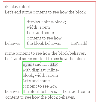
The real use of this value is when you want to give an inline element a width. In some circumstances some browsers don't allow a width on a real inline element, but if you switch to display: inline-block you are allowed to set a width.
display: table
display: table tells the element to display as a table. Nested elements should be displayed as table-row and table-cell, mimicking the good old TR's and TD's. There's also a display: table-column but it should show nothing at all, only serving for style information like a COL does. I'm not sure exactly how this works.
John Resig - Sub-Pixel Problems in CSS
John Resig - Sub-Pixel Problems in CSS - 在ie下如果用 % 來讓 row 可以 expand,如果所有 row 的總和加起來全部是100%, 也可能會發生最後一個 row drop,很有可能是這個原因,因為 ie 對於 sub-pixel 的處理方式是 round-up。John的作法是4個div evenly shared 一個 50px寬度,所以一個是12.5px。
* Round the numbers down - Both Opera and Safari round down the widths of all the divs to 12px. This leaves a 2px gap (note the green) to the right of all the divs. If you've ever wondered why your nicely-aligned navigation doesn't fill up the full contents of a container in these browsers, now you know why. On the plus side, at least you know what the width of these containers will all be the same, no matter what.
* Round the numbers up - Both Internet Explorer 6 and 7 round the widths of all the divs up to 13px. Doing this causes the floated divs to immediately wrap, breaking layouts. This is obviously wrong as it causes many safely-numbered layouts to break for no obvious reason.
* Round some numbers up and some down - Both Firefox 2 and 3 mix the rounding of the div widths to 12px and 13px. The mix of rounding is done as to provide an even result at the end (making it flush with the far edge). The obvious side effect is that the divs no longer have a consistent width to them (even though an equal width was specified by the CSS). Additionally, the reported (via a JavaScript computed style call, like offsetWidth) width of the element remains at its reported 12.5px not providing the user with any indication of which way the rounding is occurring. And to add another confusing wrench in the works: The order of which divs have a width of 13px or 12px has been flip-flopped in Firefox 3. This was done to improve efficiency and speed and seemingly little, to no, effect on general web site rendering.
How To Attack An Internet Explorer (Win) Display Bug
How To Attack An Internet Explorer (Win) Display Bug - Holly hack
A very large percentage of IE/Win bugs are triggered by the lack of any stated dimensions on elements that contain nested floats. In other words, if you have a box without either a width or a height, and nest one or more floats inside, some very weird display bugs may declare themselves. Such bugs can happen without floats, but are far rarer than the float variety.
The Peekaboo Bug falls into this "dimensional bug" class, as does the Escaping Floats Bug.
{height: 1%}
Clearing a float container without source markup
for Gecko
.clearfix:after {
    content: ".";
    display: block;
    height: 0;
    clear: both;
    visibility: hidden;
}
for ie
* html .clearfix {height: 1%;}
combine
.clearfix:after {
    content: ".";
    display: block;
    height: 0;
    clear: both;
    visibility: hidden;
}

.clearfix {display: inline-block;}

/* Hides from IE-mac \*/
* html .clearfix {height: 1%;}
.clearfix {display: block;}
/* End hide from IE-mac */
style hr
hr{border:none}在firebug下面看會是
hr{border: medium none},border-width: medium 是 border 的 default setting,可以參考 blueprint 的 demo pageStyling <hr> with CSS
Various CSS properties can be applied on <hr>:
* All three browsers allow setting width and height of the <hr> element.
* The border property can be used in IE and Mozilla. It does not work well in Opera (see examples below).
* <span style="font-weight:bold;">IE uses the color property for the <hr> element.</span>
* <span style="font-weight:bold;">Opera and Mozilla use background-color for the <hr> element.</span>
* All three browser allow setting a background-image of the <hr> element, however this is not very useful in IE and Opera (see the last example).
Eric Meyer's reset.css
CSS Tools: Reset CSS
Eric's Archived Thoughts: Reset Reasoning
This is why so many people zero out their padding and margins on everything by way of the universal selector. That’s a good start, but it does unfortunately mean that all elements will have their padding and margin zeroed, including form elements like textareas and text inputs. In some browsers, these styles will be ignored. In others, there will be no apparent effect. Still others might have the look of their inputs altered. Unfortunately, there’s just no way to know, and it’s an area where things are likely to change quite a bit over the next few years.
So that's why I don't want to use the universal selector, but instead explicitly list out elements to be reset. In this way, I don't have to worry about munging form elements. (I really should write about the weirdnesses inherent in form elements, but that's for another day.
I want all this because I don’t want to take style effects for granted. This serves two purposes. First, it makes me think just that little bit harder about the semantics of my document. With the reset in place, I don’t pick strong because the design calls for boldfacing. Instead, I pick the right element—whether it’s strong or em or b or h3 or whatever—and then style it as needed.
/* v1.0 | 20080212 */

html, body, div, span, applet, object, iframe,
h1, h2, h3, h4, h5, h6, p, blockquote, pre,
a, abbr, acronym, address, big, cite, code,
del, dfn, em, font, img, ins, kbd, q, s, samp,
small, strike, strong, sub, sup, tt, var,
b, u, i, center,
dl, dt, dd, ol, ul, li,
fieldset, form, label, legend,
table, caption, tbody, tfoot, thead, tr, th, td {
 margin: 0;
 padding: 0;
 border: 0;
 outline: 0;
 font-size: 100%;
 vertical-align: baseline;
 background: transparent;
}
body {
 line-height: 1;
}
ol, ul {
 list-style: none;
}
blockquote, q {
 quotes: none;
}
blockquote:before, blockquote:after,
q:before, q:after {
 content: '';
 content: none;
}

/* remember to define focus styles! */
:focus {
 outline: 0;
}

/* remember to highlight inserts somehow! */
ins {
 text-decoration: none;
}
del {
 text-decoration: line-through;
}

/* tables still need 'cellspacing="0"' in the markup */
table {
 border-collapse: collapse;
 border-spacing: 0;
}
CSS-Tricks Finally Gets A Print Stylesheet - CSS-Tricks
CSS-Tricks Finally Gets A Print Stylesheet - CSS-Tricks - 記錄一些對 print style 的想法, 相當值得參考
body {
 font-family: Georgia, serif;
 background: none;
 color: black;
}

page {
 width: 100%;
 margin: 0; padding: 0;
 background: none;
}

#header, #menu-bar, #sidebar, h2#postcomment, form#commentform, #footer {
 display: none;
}

.entry a:after {
 content: " [" attr(href) "] ";
}

#printed-article {
 border: 1px solid #666;
 padding: 10px;
}
1. Make the type as readable as possible
On the web, the body type for articles here is a sans-serif. On the printed page, I think that serif fonts are easier to read so I reset the font-family to Georgia. No background and black text is the default, but just in case, I explicitly declare it in the body.
2. Use as much of the page as possible
Again, I think this is default behavior, but since I wrap my content in a "page" tag anyway I thought I would make use of that to set a 100% width and remove any margin and padding.
3. Remove the extra stuff
Chances are, if someone is printing an article of yours it is because they want to save the content as reference material, read it later, or share it with a friend. They really don’t need to see your page navigation, sidebar, or fancy footer. Again assuming that you have nice and semantically marked up code, removing those sections should be as easy as setting the display value of the parent elements of those areas to none.
4. Display the URLs in the body content
[Thanks to David Walsh for this idea] Links in your content don’t do any good on the printed page. It would be pretty cool if you could just tap the linked word with your finger and it would open the webpage on your computer, but thats something I haven’t even seen in the movies yet. For now, we can just use CSS pseudo class “:after” to drop in the URL right next to the link, using the content attribute. IE doesn’t support it, but c'est la vie.
5. Include a thank-you note
At the end of my content, I put a little "thank you" note. This area gets hidden on the web, but is displayed when printing the article. I think it’s just a nice touch and also serves as a reminder they should come back to the website for fresh stuff.
6. Optional: Page breaks
I didn’t feel my articles really warranted specific page breaks, but if you write really long articles with sub headers, you should definitely consider placing page breaks before each of those sub headers. Another place that would be good to use a page break is right before a fairly large table. Nothing is worse than having to flip between pages looking at a table because it happened to fall overlapping two pages when it could have fit onto one. I plan to use these on a case-by-case basis. More on page breaks here.
Equidistant Objects with CSS - CSS-Tricks
Equidistant Objects with CSS - CSS-Tricks - this is useful!
Example
FAIL: Give each object a percentage left position
<img src="images/shape-red.png" class="first-r">
<img src="images/shape-green.png" class="second-r">
<img src="images/shape-yellow.png" class="third-r">
<img src="images/shape-blue.png" class="fourth-r">

img.first-r { left: 0%; position: relative; }
img.second-r { left: 25%; position: relative; }
img.third-r { left: 50%; position: relative; }
img.third-r { left: 75%; position: relative; }
FAIL: Give the objects a common left percentage margin
<span class="do-not-wrap">
 <img src="images/shape-red.png">
 <img src="images/shape-green.png" class="mover">
 <img src="images/shape-yellow.png" class="mover">
 <img src="images/shape-blue.png" class="mover">
</span>
img.mover {
 margin-left: 15%;
}
FAIL: Just use a table!
<table>
 <tr>
  <td class="leftalign">
   <img src="images/shape-red.png">
  </td>
  <td>
   <img src="images/shape-green.png">
  </td>
  <td>
   <img src="images/shape-yellow.png">
  </td>
  <td class="rightalign">
   <img src="images/shape-blue.png">
  </td>
 </tr>
</table>
PASS: First on the left, float the rest right in equal size boxes
<img src="images/shape-red.png">
<div id="movers-row">
 <div><img src="images/shape-green.png"></div>
 <div><img src="images/shape-yellow.png"></div>
 <div><img src="images/shape-blue.png"></div>
</div>
#movers-row {
 margin: -120px 0 0 120px;
}
#movers-row div {
 width: 33.3%;
 float: left;
}
#movers-row div img {
 float: right;
}
Float-less CSS layout
Float-less CSS layout - 用 display:table, display:table-row, display:table-cell 弄出來的。
No div, no float, no clear, no hack*, no joke! A CSS layout that does not use DIV, FLOAT, CLEAR nor structural HACK!
No FLOAT means fewer IE bugs:
* Doubled Float-Margin bug,
* Three Pixel Text-Jog bug,
* Etc.
and here's the comment from Chris Coyier
For another thing, I don’t see what’s so wrong with floats. I know about the IE double margin thing. Big deal. Clearing floats can be a little unsemantic but it works and it’s valid and it’s nothing to re-create your entire layout over. For another thing, it says it’s hack free but clearly uses a hack right in it’s own header. You might argue that conditional comments aren’t hacks but I feel they are at least in the same genre. Still, despite all these things, I gotta admit it does a damn good job of what it says it does. The layouts are very solid.
Grauw’s web spot - The www-style CSS FAQ
Grauw’s web spot - The www-style CSS FAQ
Q: What is incremental rendering
Incremental rendering is the ability to display the contents of a document which is still being loaded. This is a valueable asset, because users do not have to wait for the entire document to load, which can take a fair amount of time depending on the size of the document, the bandwidth of the client, the bandwidth of the server, the locations of the client and the server, etc.
An important part of incremental rendering is to avoid reflows. A reflow of the entire document means it has to be drawn all over again, which is a very slow process, and thus has to be avoided whenever possible.
Thus, incremental rendering and avoiding reflows is important to CSS because it keeps things fast and simple. Especially on lower-end systems such as mobile phones, webtv, and browsers on old computers such as the MSX reflows are extremely costly operations. But also on modern systems such as desktop PCs they have a considerable performance impact, resulting in very slow responsiveness while loading, and often also ugly visible ‘snaps’ when the location of things change as more content is loaded (you can often see this in table-based layouts).
3/05/2008
Acid3 is out
he third Acid test, again compiled by Ian Hickson. This one viciously tests DOM Scripting standards compliance and currently exposes flaws in every browser.
Acid3: Putting Browser Makers on Notice, Again. - The Web Standards Project
Acid3 Browser Test - The Web Standards Project
* DOM2 Core
* DOM2 Events
* DOM2 HTML
* DOM2 Range
* DOM2 Style (getComputedStyle, …)
* DOM2 Traversal (NodeIterator, TreeWalker)
* DOM2 Views (defaultView)
* ECMAScript
* HTML4 (<object>, <iframe>, …)
* HTTP (Content-Type, 404, …)
* Media Queries
* Selectors (:lang, :nth-child(), combinators, dynamic changes, …)
* XHTML 1.0
* CSS2 (@font-face)
* CSS2.1 (’inline-block’, ‘pre-wrap’, parsing…)
* CSS3 Color (rgba(), hsla(), …)
* CSS3 UI (’cursor’)
* data: URIs
* SVG (SVG Animation, SVG Fonts, …)
Take the Acid3 test.
3/04/2008
web.Frontend :: 翻译:On having layout :: April :: 2006
web.Frontend :: 翻译:On having layout :: April :: 2006
对已渲染元素的重排(re-flow)
当所有元素都已渲染完成时,如果有一个因鼠标经过而引起的变化产生(比如某个链接的 background 有变化),IE会对其 layout 包含区块进行重排。有时一些元素就会因此被排到了新的位置,因为当这个鼠标经过发生时,IE已经知道了所有相关元素的宽度、偏移量等数据了。这在文档首次载入时则不会发生,那时由于自动扩张的特性,宽度还无法确定。这种情况会导致在鼠标经过时页面出现跳变。
* Jump on :hover
* quirky percentages: the reflow
这些和重排问题相关的 bug 会给百分比边距和补白使用较多的流动布局带来不少麻烦。
pseudo-class, pseudo-element, pseudo-CSS: IE/Win bugs with :first-letter, :hover & Co.
Jump on :hover as a consequence of the re-flow
IE6: It's a basic concept of CSS that a page is incrementally rendered, so the user doesn't have to wait until all elements are loaded. The very special situation in IE by allowing containers to expand in width and height ("expand-to-fit"), even when a dimension is given, forces IE to make assumptions on the real boundary of an element. Now, roughly, assumptions can be wrong. On :hover, IE re-renders the elements of a "layout" block, the elements re-flow, but at this moment, all the dimensions are known to IE (they were determined in the first round). This results in a jump on hover, especially on percentage margins and paddings (e.g. in the Holy Grail layout jump), but can be seen in other bug-related situations too. The jump usually corrects the initial misplacement, the jump often indicates that we have to search for a wrong placement of the element before the hover event is performed.
IE7: Like in IE6, it's a rule of thumb that a relatively positioned container needs haslayout, otherwise strange things like disappearance or jumping of the descendants might occur. A :hover event might be the trigger. Check for the haslayout-state of parent elements in these cases.
Unrelated to this, sometimes the 'trivial' cause of a jump on hover is the declaration of a border at the hover-state only, and a fix is to apply a invisible background-colored similar border on the link.
3/03/2008
Web Bug Track: bug 165 - dynamic pre population fails in IE
Web Bug Track: bug 165 - dynamic pre population fails in IE
<script type="text/javascript">
myPreObj.innerHTML = 'This\nWill\nFail... no linebreaks or spaces';
</script>
Example Workaround Code:
<script type="text/javascript">
myPreObj.innerHTML = 'This\nWill\nFail... no linebreaks or spaces';
myPreObj.innerHTML = myPreObj.innerHTML;
</script>
keyword: preserve pre whitespace
Every keystroke is a prisoner - a neat commenting trick
Ajaxian » Every keystroke is a prisoner - a neat commenting trick
If you however use the following syntax then you only need to delete one slash to comment and uncomment a section:
foo();
/*
bar();
baz.foo = 200;
return{
  dolly:clone()
}
// */
foo();
//*
bar();
baz.foo = 200;
return{
  dolly:clone()
}
// */
in CSS you can just delete and add and remove an asterisk:
.test{
    border:1px solid red;
    /*/
    background-color:blue;
    /**/
    margin:1em;
}
.test{
border:1px solid red;
/**/
background-color:blue;
/**/
margin:1em;
}
xssinterface - Google Code
xssinterface - Google Code
The xssinterface javascript library enables communication of multiple pages (or pages and iframes) via javascript functions across domain boundaries. This may be useful for websites that want to expose a limited javascript interface to embedded widgets.
xssinterface works in all browsers that support the postMessage() interface and implements a fallback mechanism that works in most current browsers.
How it works?
For Browsers that support it, we use the postMessage() interface.
If the Browser has Google Gears installed, we use Gears cross origin workers.
For all other browsers, we use the following mechanism:
All sites that participate in the cross domain calls must provide an html file (cookie_setter.html) that is provided by this library that enables other domains to place certain cookie under the domain of the site.
The library uses this mechanism to place cookies on the target domain that are then read and evaluated by the target page.
Pages must explicitly grant access to their domain by setting a security token cookie under a domain that is allowed to access the callbacks.
function sayHello() {
  var caller = new XSSInterface.Caller("www.two.com","/cookie_setter.html","channel1");
  caller.call("hello", "Hello World")
}
window.onload = function () {
window.xssListener = new XSSInterface.Listener("1234567890","channel1");
window.xssListener.allowDomain("www.one.com", "/cookie_setter.html");
window.xssListener.registerCallback("hello", function (msg) {alert(msg)} )
window.xssListener.startEventLoop()
}
Theo Jansen的神奇機械動物
Theo Jansen的神奇機械動物 | vgod’s blog - 第一次看到覺得很像是 wild wild west 裡面的八腳機械怪獸,整個做起來還蠻有感覺的。
訂閱:
文章 (Atom)
